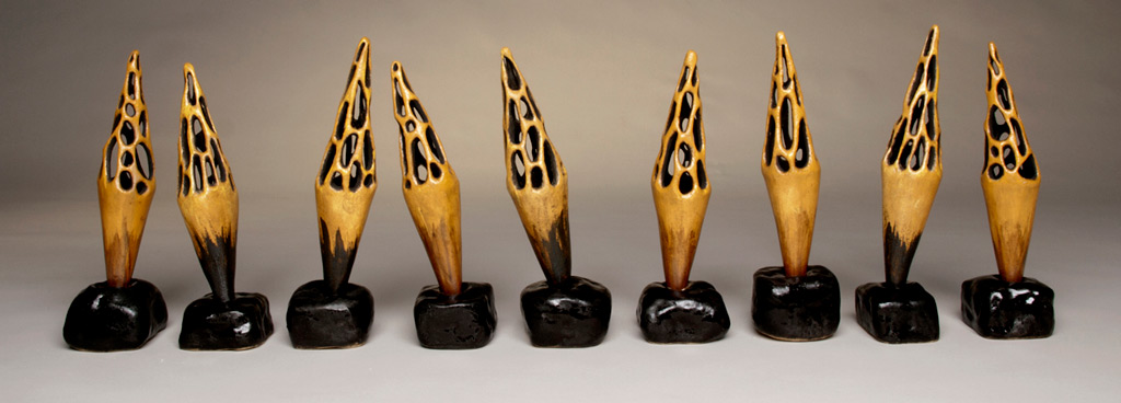
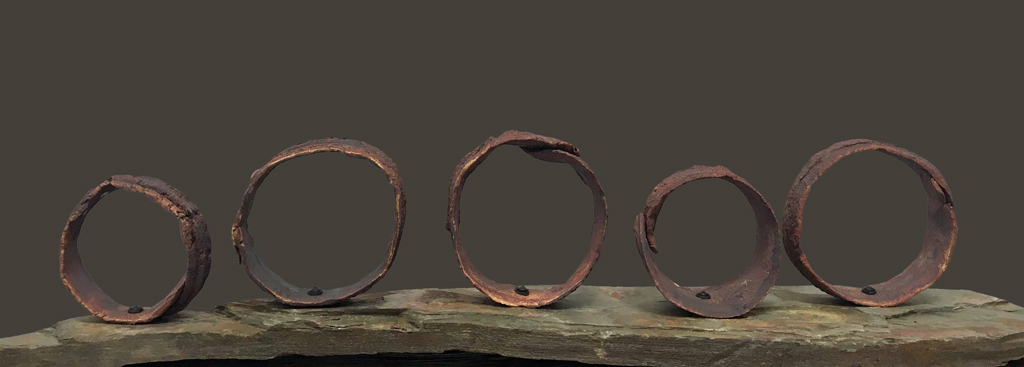
If you have a website, you probably have a similar problem to me, maintaining it, keeping it fresh and at the same time consistent throughout. It may not look like a lot, but it’s days worth of work to create new pages, write content, format images just right and to get that one damn photo to nudge over when it just refuses to be centered. But with time on my hands these days, I’ve decided to attack this project a little at a time.
I’ve found that I’ve got too much content in some area which makes it hard for viewers to find the work they are looking for or to share direct links to past pieces. To solve this, I’ve decided to break up some of the content heavy areas into new categories. It’s been fun going through older pages and revisiting work I hadn’t looked at in a long time! There are videos to watch on a number of the In the Field and Installations pages as well as behind the scenes installation photos. Here’s how it’s now organized…
If you click the portfolio tab on the main page, you can now see work listed as:
In the Field which are my ephemeral outdoor installations
Installations which is mainly gallery or museum exhibits
Objects which are generally smaller individual pieces
Public Art pieces which showcase any permanent or long term installations in public spaces
Collected Works which are selected works in clients homes
Works for Sale which will take you to the online Shop.
Originally, all of that content was on only three pages and you had to scroll through it all, so I hope that this makes it easier for viewers to find what they are looking for. I’ll still be tweaking, adjusting layouts and adding content so check back often to explore more of my works.
If you haven’t checked in on my website in awhile, please do and enjoy exploring!

